Sunday, November 10, 2013

[Personal UX/UI review] Jihachul's history and iOS's scroll-down summary

<app: Jihachul>
Positive: history function readily available when searching for a subway station 

Lesson: always consider providing a 
menu of users' most frequently selected function 

<function: scroll-down summary on iOS>
Issue: displaying a useless space even when there is no schedule

Recommendation: shrink the Calendar space to fit schedule amount (e.g. if no schedule, shrink the space all the way!)

Tuesday, November 5, 2013

[Personal UX/UI review] TV screens inside of subway

Issue: no indication on next stop on screen

Recommendation: always include next stop conveniently on screen so that passengers don't need to look around to find one 

Saturday, November 2, 2013

[Personal UX/UI review] success factor for a chicken franchise

Positive: 
1. convenient food- chickens with no bones providing a sense of relief in eating chicken
2. simple menu choice- mainly two (i.e. sweet, spicy) providing easy selections for a quick bite
3. transparency in food making- visible food process satisfying hygienic needs 

Recommendation: provide a pricing of  6,000 KRW for a half and half menu (i.e. half sweet and half spicy) to fill in the niche needs to have both 
(c.f. In Korean culture, people love sharing food; part of the reason for sharing is to fulfill curiosity for other options or perhaps to have it all with psychological reasons. For example, this curiosity concerning food in its "ultimate" form can be portrayed in mixed food menu (aka 짬짜면) as commonly found in Korean Chinese restaurants.)

Thursday, October 31, 2013

[Personal UX/UI review] signs in Seolleung Stn. perhaps

Issue: the ceiling sign has misled me not to go under the sign but look for an exit sign located on the far left on this photo

Recommendation: include exit numbers in the ceiling sign for passengers' intuitive understanding of direction 

Tuesday, October 29, 2013

[Personal UX/UI review] Samsung Electronics newspaper and light box ads

Issue: still hardware specs ads
(c.f. Samsung's video ad: http://www.samsung.com/africa_pt/?brightcove=2748971527001#latest-home)

Recommendation: advertise how the optical zoom and smartphone combination enhance people's lives 

Issue: information architecture of this light box display is not intuitive enough to understand which text explains which picture

Recommendation: visual categorization of information needs to be implemented 
For example, 


Friday, October 25, 2013

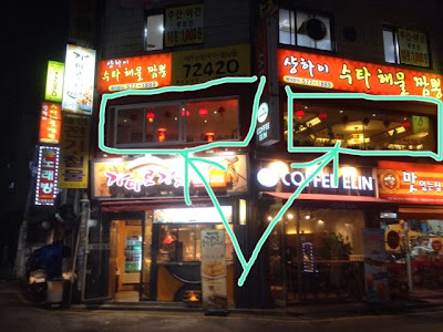
[Personal UX/UI review] 2nd floor store design, logo positioning,pricing

Positive: clean window and bright lighting for 2nd floor restaurant

Lesson: to attract customers on the 2nd floor, deal with issues that customers care the most (e.g. hygiene, doubts about shaggy business) 

Issue: no logo

Recommendation: put logo in front of company name to increase brand recognition and awareness

Issue: same product with different pricing

Recommendation: standardize pricing (i.e. make the price the same)

Tuesday, October 22, 2013

[Personal UX/UI review] Google Drive's lack of system detection

Issue: though users already downloaded the application, this Google Drive, a cloud-base web application doesn't detect that (c.f. Google+ doesn't detect installed app on users' smartphone, either) 

Solution: if installed, simply remove the icon from users' Drive webpage

Lesson: website needs to be able to "customize" or "respond" to users' current system